CSS Custom Properties, commonly known as CSS Variables, have transformed the way developers build modern user interfaces. Instead of hardcoding values throughout a stylesheet, variables allow teams to centralize colors, spacing, typography, and other design decisions in one place.
A well designed design system improves consistency, reduces maintenance costs, and allows developers to scale applications efficiently. Whether you're building a small website or a large enterprise platform, CSS variables provide a flexible and future ready solution.
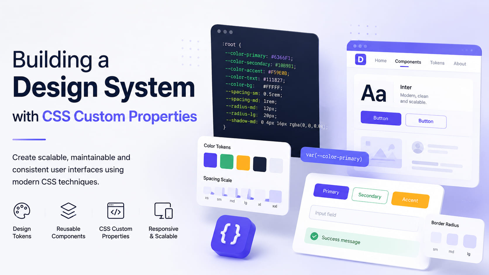
Why CSS Custom Properties?
Traditional preprocessors such as SASS and LESS introduced variables years ago, but CSS Custom Properties work directly inside the browser and can be updated dynamically at runtime.
This means themes, colors, spacing, and layouts can change without recompiling stylesheets, making them ideal for modern applications.
They also improve code readability by eliminating repeated values and encouraging reusable design tokens.
Creating Design Tokens
The first step in building a design system is defining your core design tokens. These tokens represent reusable values such as colors, spacing, and border radius.
:root {
    --color-primary-100: #3ebbfa;
    --color-primary-500: #2a7ea8;
    --spacing-md: 1rem;
    --radius-lg: 18px;
}
Instead of repeating these values throughout your CSS, you simply reference them whenever needed.
Using Variables in Components
Once your tokens are defined, they can be reused across buttons, cards, forms, and navigation components to maintain consistency.
.button {
    background: var(--color-primary-500);
    padding: var(--spacing-md);
    border-radius: var(--radius-lg);
    color: white;
}
This approach makes updates simple. Changing one variable automatically updates every component that depends on it.
Responsive Design with CSS Variables
CSS variables can also work with media queries, allowing layouts to adapt across different screen sizes without rewriting component styles.
:root {
    --space: 1rem;
}

@media (min-width: 768px) {
    :root {
        --space: 2rem;
    }
}
Every component using var(--space) will automatically adjust when the screen size changes.
Supporting Light and Dark Themes
One of the biggest advantages of CSS variables is the ability to switch themes dynamically.
:root {
    --background: #ffffff;
    --text: #222222;
}

.dark-theme {
    --background: #1a1a1a;
    --text: #f5f5f5;
}
By toggling a single class, the entire application's appearance can change instantly.
Best Practices
- Use meaningful names for variables.
- Group variables into design tokens such as colors, spacing, and typography.
- Avoid hardcoded values inside components whenever possible.
- Keep variables centralized for easier maintenance.
- Combine CSS variables with modern layout techniques like Flexbox and Grid.
Conclusion
CSS Custom Properties are an essential part of modern frontend development. They make applications easier to maintain, improve consistency, and enable dynamic theming and responsive design.
Whether you're creating a personal portfolio or a large enterprise platform, investing in a proper design system powered by CSS variables will save development time and create a better user experience.
A strong design system starts with smart, reusable design tokens.